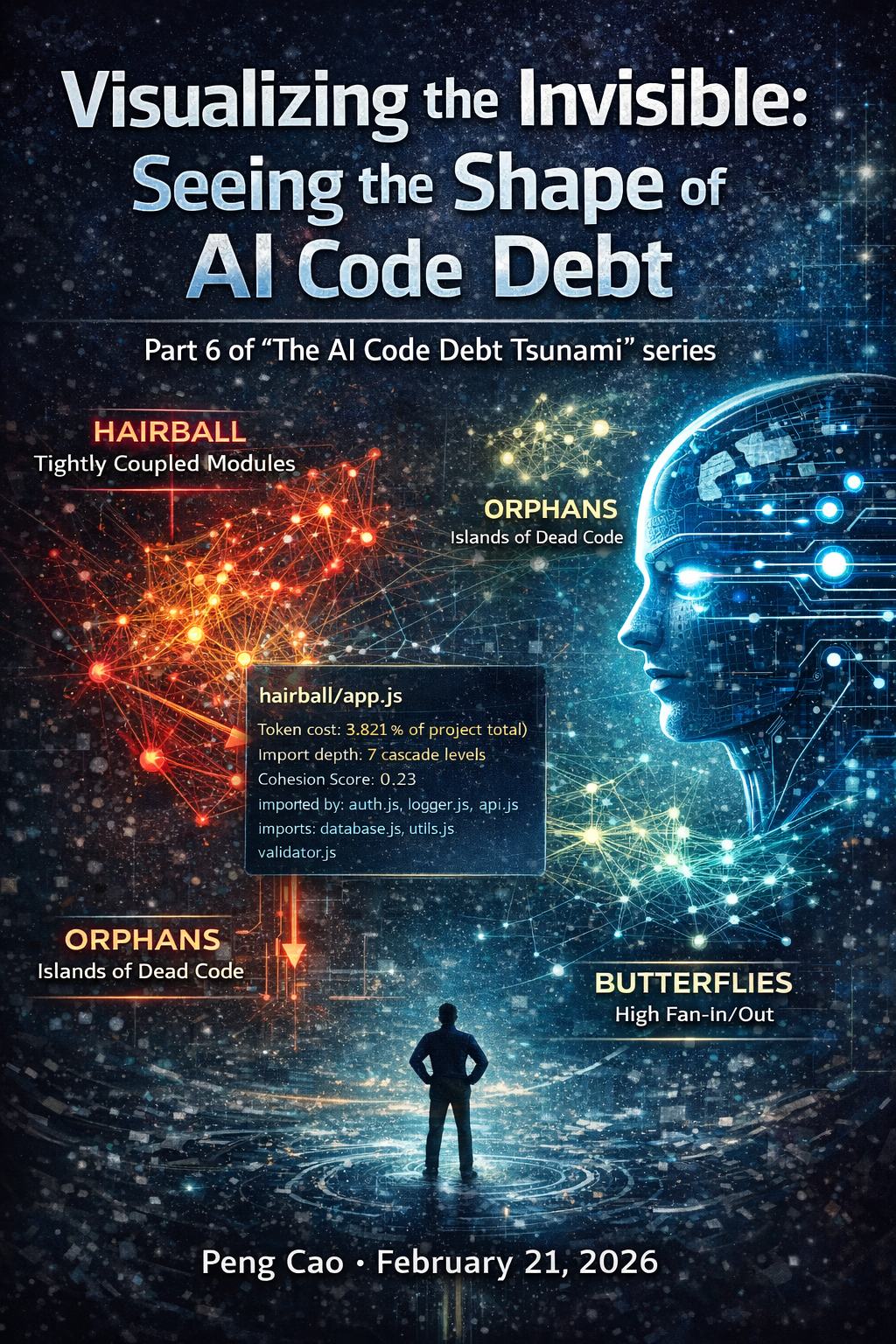
Visualizing the Invisible: Seeing the Shape of AI Code Debt
Part 6 of "The AI Code Debt Tsunami" series
When we talk about technical debt, we usually talk about lists. A linter report with 450 warnings. A backlog with 32 "refactoring" tickets. A SonarQube dashboard showing 15% duplication.
But for AI-generated code, lists are deceiving. "15 duplicates" sounds manageable—until you realize they are all slight variations of your core authentication logic spread across five different micro-frontends.
Text-based metrics fail to convey structural complexity. They tell you what is wrong, but not where it fits in the bigger picture. In the age of "vibe coding," where code is generated faster than it can be read, we need a new way to understand our systems. We need to see the shape of our debt.
The Solution: Introducing the AIReady Visualizer
To tackle this, we've built the AIReady Visualizer. It's not just another static dependency chart; it’s an interactive, force-directed graph that maps file dependencies and semantic relationships in real-time.
By analyzing import statements and semantic similarity (using vector embeddings), we render your codebase as a living organism. When you see your code as a graph, the "invisible" structural problems of AI code debt suddenly become obvious visual patterns.
The Shape of Debt: 3 Visual Patterns
When we run the visualizer on "vibe-coded" projects, three distinct patterns emerge—each signaling a different kind of risk.
1. The Hairball (Tightly Coupled Modules)
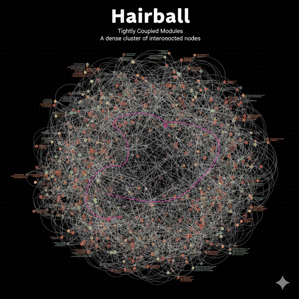
What it looks like: A dense, tangled mess of nodes where everything imports everything else. There are no clear layers or boundaries.
The Problem: This pattern kills AI context windows. When an AI agent tries to modify one file in a "Hairball," it often needs to understand the entire tangle to avoid breaking things. Pulling one file into context pulls the whole graph, leading to token limit exhaustion or hallucinated dependencies.
The Fix: You need to refactor by breaking cycles and enforcing strict module boundaries. The visualizer helps identify the "knot" that holds the hairball together.
2. The Orphans (Islands of Dead Code)
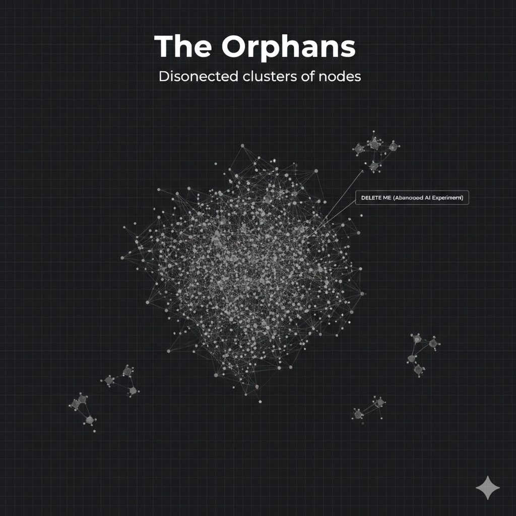
What it looks like: Small clusters or individual nodes floating completely separate from the main application graph.
The Problem: These are often fossils of abandoned AI experiments—features that were generated, tested, and forgotten, but never deleted. They bloat the repo size and confuse developers ("What is this legacy-auth-v2 folder doing?"). More dangerously, they can be "hallucinated" back to life if an AI agent mistakenly imports them.
The Fix: If it's not connected to the entry point, delete it. The visualizer makes finding these islands trivial.
3. The Butterflies (High Fan-In/Fan-Out)
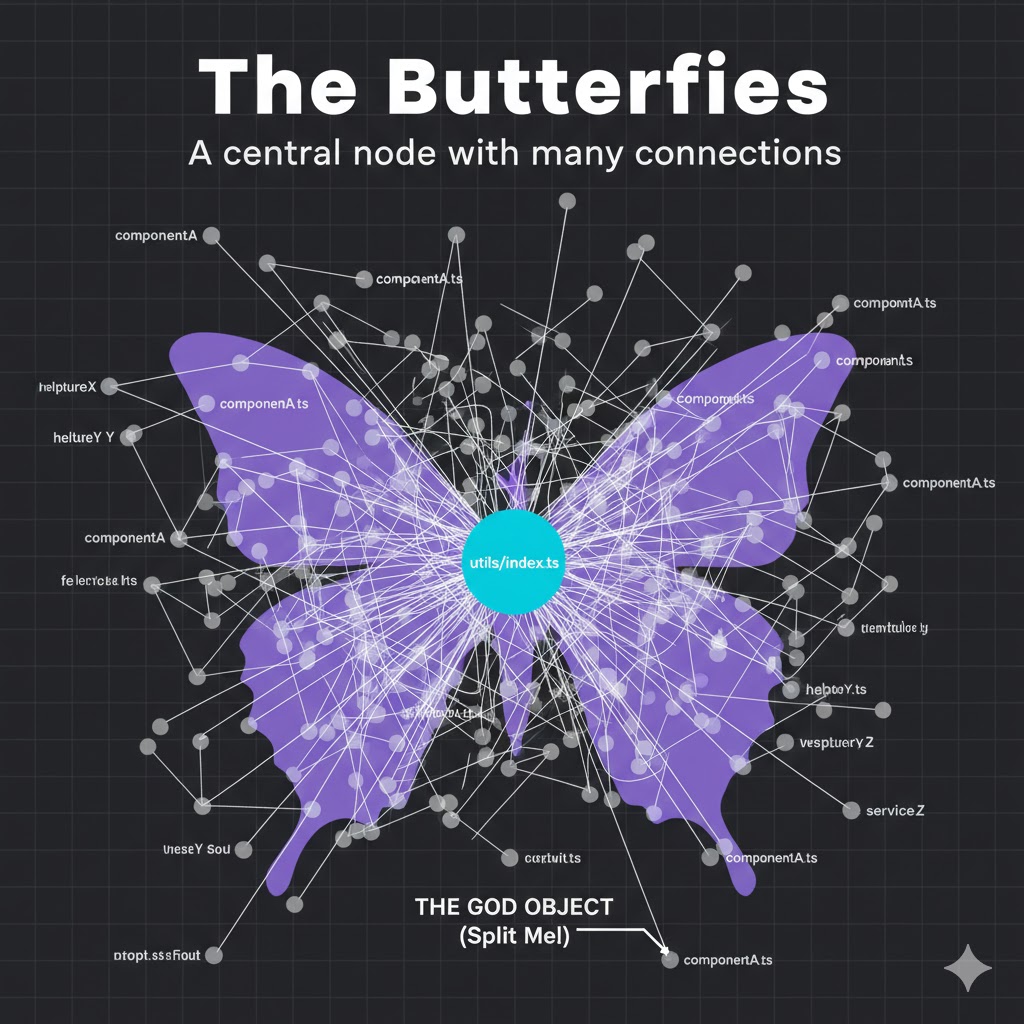
What it looks like: A single node with massive connections radiating out (high fan-out) or pointing in (high fan-in). Often seen in files named utils/index.ts or types/common.ts.
The Problem: These files are bottlenecks and context bloat.
- High Fan-In: Changing this file breaks everything. AI agents struggle to predict the blast radius of changes here.
- High Fan-Out: Importing this file brings in a massive tree of unnecessary dependencies, polluting the AI's context window with irrelevant code.
The Fix: Split these "god objects" into smaller, deeper modules.
How It Works
Under the hood, the AIReady Visualizer combines two powerful tools:
- @aiready/graph: Our analysis engine that parses TypeScript/JavaScript ASTs to build a precise dependency graph. It creates a weighted network of files based on import strength and semantic similarity.
- D3.js: We use D3's force simulation to render this network. Files that are tightly coupled naturally pull together, while unrelated modules drift apart, physically revealing the architecture (or lack thereof).
Use Case: Bridging the "Vibe" Gap
We're seeing a growing divide in engineering teams:
- The "Vibe Coders": Junior devs or founders using AI to ship features at breakneck speed. Their focus is output.
- The Engineering Managers: Seniors trying to maintain stability and scalability. Their focus is structure.
The visualizer bridges this gap. It's hard to explain abstract architectural principles to a junior dev who just wants to "ship it." It's much easier to show them a giant, tangled "Hairball" and say, "See this knot? This is why your build takes 15 minutes and why the AI keeps getting confused."
Visuals turn abstract "best practices" into concrete, observable reality.
See Your Own Codebase
Don't let your codebase become a black box. You can visualize your own project's shape today.
The visualizer ships as part of the unified @aiready/cli. Three commands gets you a full interactive graph:
# 1. Scan your codebase
npx aiready analyze

# 2. Start the interactive visualizer
npx aiready visualise

# 3. Export a shareable static report
npx aiready visualise --output report.html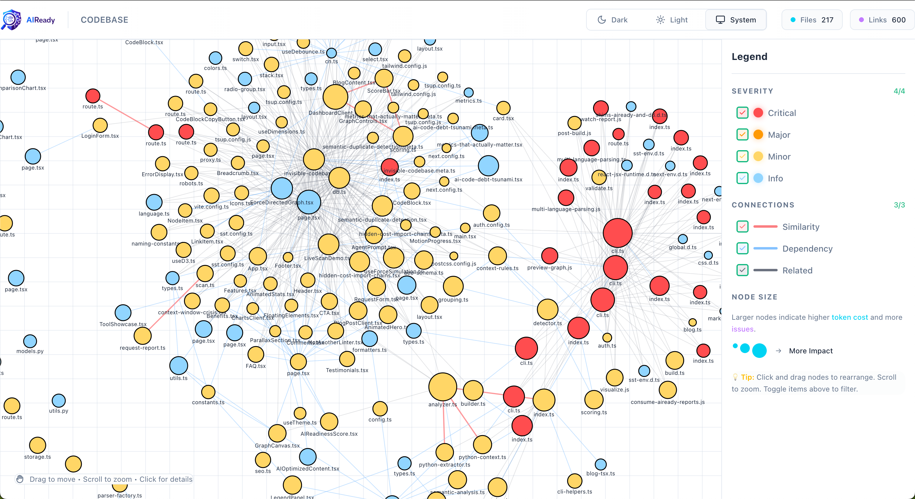
Example visualiser output highlighting clusters and token-cost overlays.
The output gives you:
- Colour-coded nodes by AI readiness score (green → red)
- Edge thickness proportional to import coupling strength
- Cluster labels automatically identifying Hairballs, Orphans, and Butterflies
- Hover tooltips showing token cost, import depth, and cohesion score per file
- A shareable HTML report you can open anywhere — no tooling required
What's Next
This wraps up the six-part “AI Code Debt Tsunami” series. If you've followed along, you now have:
- Why AI code debt forms faster than traditional debt
- Why your codebase is invisible to AI — semantic duplicates, fragmentation, low cohesion
- What metrics actually capture AI-readiness
- How to detect semantic duplicates automatically
- How to measure and reduce import-chain context costs
- How to see the shape of your debt visually ← You are here
The natural next step is moving from detection to remediation — which is exactly what the AIReady Platform (currently in beta) is designed to do: auto-generated refactoring plans, trend tracking over time, and team-level benchmarks.
Resources:
- GitHub: github.com/getaiready/aiready-cli
- Docs: getaiready.dev
- Report issues: github.com/getaiready/aiready-cli/issues
Found a Hairball, Orphan, or Butterfly in your graph? Share a screenshot in the comments — I'd love to see what patterns show up in the wild.
*Peng Cao is the founder of receiptclaimer and creator of aiready, an open-source suite for measuring and optimising codebases for AI adoption.*
Read the full series:
Join the Discussion
Have questions or want to share your AI code quality story? Drop them below. I read every comment.